I will never tire of watching this...
Wednesday, 25 May 2011
Saturday, 21 May 2011
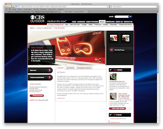
Advertising on the Underground
One of my proposals is advertising on the Underground, so I have looked into what formats are available. I found that the 48 sheet will be most appropriate.
Taken from CBS Outdoor:
48 Sheet
'The flagship site on the Underground; cross-track 48 Sheets are arguably the most important media property in the UK. Of course they deliver stature, they are large and consumers are a matter of feet away but also add to this the quality and weight of the Underground audience.
However, the true strength of Underground 48s lie in their ability to drive public awareness and debate in London. Demonstrated through various case studies such as the ‘Time To Consider’ campaign – whether you have long copy or a very simple creative execution, commuters welcome the stimuli and will spend time actively consuming your ad both on the platform and beyond.
So when the solution is right in front of you, why would you consider anything but cross-track advertising?'
This is only in Landscape format.


Friday, 20 May 2011
Interesting Visuals...7
This is similar to an idea I've already had, just without the three dimensional twist!
Interesting Visuals...6
This would be an ideal kind of texture for Downtempo, flowing, fluid movements.
Interesting Visuals...5
I love the lightning effect, I think it could work really well as a visual for an equalizer.
Interesting Visuals 4
Cool visual, this is using the Trapcode plugin also. This would be a suitable kind of visual for the Downtempo ident.
Interesting Visuals 3
Awesome! Wish I had the first idea of how to create something like this. I keep seeing on posts people mentioning a Trapcode plugin (used to produce this)... I may need to do more research!
Interesting Visuals...2
Cool visual, I've had some ideas in my head similar to this, but my lack of software knowledge would probably prevent me from creating something like this.
Interesting Visuals...1
Fantastic piece of illustration and animation, using watercolour/ink blots to show an interesting mix of colour and movement.
Downtempo and Dubstep Visuals
After my chat with Fred I now realise I have to grasp the visual language of the music rather than creating my own. Downtempo is the only one I have not grasped yet, and to further my design development I think it is essential. The genre of downtempo is very relaxed and almost hypnotic with its loops.


Looking at album covers is important as it's the only place really where people will see visuals for Dubstep, there isn't a lot of it on TV apart from the album covers when promoting new albums.


The front cover for this really portrays downtempo, the colours of the lingering smoke look quite hypnotic. I could see this working really well as a moving visual.

This is a very simplistic design, and portrays the minimal type of music.

I love this man! Awesome music, the image on the front cover is where the music takes you, it's so relaxing yet catchy. Although I won't be using photographic imagery for my work.

Really effective cover, the flow of the illustrations echo the flow of the chill out music, and the text works well with the illustrations. The colours portray relaxation and tranquility too, as they aren't too vivid.
Looking at album covers is important as it's the only place really where people will see visuals for Dubstep, there isn't a lot of it on TV apart from the album covers when promoting new albums.


The imagery for these are much cleaner and tidy looking compared to the Drum and Bass visuals.
Sunday, 15 May 2011
Successful Logos...Channel 4
Another logo I think has been really successful is the Channel 4 logo. I have found the identity guidelines which specifies the criteria for the logo in times of reproduction for screen and print.
'Many brands place their logos
in the bottom right position of
the page. However Channel 4
places its logo in a distinctive
centre right position. This is
unique to the channel and is
therefore instantly
recognisable.' Channel 4
This shows the isolation area for the logo - it should always appear with an area of space around it equivalent to 0.3 of the height of the logo.


Recommended logo sizes:

'Many brands place their logos
in the bottom right position of
the page. However Channel 4
places its logo in a distinctive
centre right position. This is
unique to the channel and is
therefore instantly
recognisable.' Channel 4
Guidelines.


This shows the isolation area for the logo - it should always appear with an area of space around it equivalent to 0.3 of the height of the logo.
e.g. Height = 100mm
Space = 30mm


In the guidelines it also specifies of what not to do with the logo:

The colour palette:

A3 Portrait 54 mm
A4 Portrait 40 mm
A4 Landscape 42 mm
Brochure 44 mm
210 Squared 38 mm
A5 Portrait 34 mm
A5 Landscape 34 mm

Saturday, 14 May 2011
What Is Graphic Design For? (Functions/Purposes)
Functions/Purposes that interest me:

Audi has some great adverts. I particularly like this as a still with the clever catch line as some petrol engines are renowned for guzzling fuel.
EDUCATE:

This is a clever use of typography and a very visual way of displaying dyslexia. It's a great way to educate people, as this is how some people with dyslexia see words. The letters are in the correct place but not the right way round etc.
HUMOUR:

Everyone likes things that make them laugh. I like Graphic Design that makes me laugh, or even just smile. This made me smile.
*This next piece may offend*

Usually, I hate this word. But it looks so much better hand lettered!
- Advertise
- Educate
- Humour
ADVERTISE:
Audi has some great adverts. I particularly like this as a still with the clever catch line as some petrol engines are renowned for guzzling fuel.
EDUCATE:

This is a clever use of typography and a very visual way of displaying dyslexia. It's a great way to educate people, as this is how some people with dyslexia see words. The letters are in the correct place but not the right way round etc.
HUMOUR:

Everyone likes things that make them laugh. I like Graphic Design that makes me laugh, or even just smile. This made me smile.
*This next piece may offend*

Usually, I hate this word. But it looks so much better hand lettered!
Friday, 13 May 2011
What Is Graphic Design For? (Audience/Context)
Audiences/Contexts that interest me:


VIRALS:
- Drinkers
- Music fans
- Clever health campaigns
- Virals
MUSIC FANS:

I love the colours and textures used within this ad. It shouts summer and sun to me which is what its all about, partying in the summer for a weekend. The disjointed type works well against the textured background.
DRINKERS:

DRINKERS:

The purity of the Smirnoff adverts attracts my interest. I know that is what it is trying to portray, but the adverts are so clear and clean cut, whereas the Southern Comfort ads can be rather hectic and chaotic. Alcohol advertising is a really interesting path for me, as a member of their target audience I think it is all the more appealing. And after working on the Glayva campaign, I appreciate it so much more.
CLEVER HEALTH CAMPAIGNS:
VIRALS:
What Is Graphic Design For? (Specialisms/Skills)
Specialisms/Skills that interest me:
- WEB DESIGN

- Illustration
- Hand crafting
- Web design
- Motion Graphics
- MOTION GRAPHICS
This combines motion graphics and handcrafting, awesome. Absolutely awesome. Please watch this.

A cool and funky site, simple navigation but interesting visuals. Why can't all websites be like this?

I like the colour combination used here, it's not one I would put together personally, but orange and blue are complementary colours.
- ILLUSTRATION:

By Francesca Hotchin who is studying Graphic Design at Leeds Uni... Very talented! I wish I could draw like this.


By Francesca Hotchin who is studying Graphic Design at Leeds Uni... Very talented! I wish I could draw like this.

By Brooke Hagel, for Mui Mui. I do enjoy fashion illustration... If only I could do it.
Thursday, 12 May 2011
TV Logo Position Analysis
A look at where and how the channel logos are positioned. After speaking to my tutor, Lorraine, she said to observe this with the rule of thirds in mind.


All of the logos fit into the top left third, but there is no real consistency of position within this. The thirds could easily be divided into sixths but again there's no universal positioning.
Wednesday, 11 May 2011
Research into my chosen genre

In the current Top 10 for compilations are 3 albums featuring Drum and Bass and Dubstep. I am finding as the release of Dubstep compilations are sold in mainstream music shops e.g. HMV, they are making it into at least the Top 20 rapidly showing a growing increase in the Dubstep genre. This time two years ago it was seldom heard on the radio let alone the TV, and now Dubstep can be heard in television shows especially Skins and Hollyoaks.
Current Imagery for Drum and Bass
Imagery for Drum and Bass:


The imagery for these are quite busy and at times cluttered. I love the simplicity for the Drum and Bass Arena logo and identity...


I love the three dimensional element to this, it's a really powerful visual, and not quite as loud and garish as the original:


Tuesday, 10 May 2011
Graphic Equalizers
After deciding on wanting to incorporate some kind of graphic equalizer into my work, I needed to research how they operate visually. And what kind of equalizer or audio spectrum would be appropriate to my work...
This was created with the software Maya, I like how the way the bars appear to look like neon lights and the use of opacity for the bars that aren't fully 'lit'.
I like the colours used for this one, however I am not as keen on the solid bars.
This, I believe, is an effect in After Effects, according to the caption it took an hour to render, my only question why? I can't see why someone would want to use a preset effect to a track that isn't theirs, none of it is the users work. I do like the glowing red though.
This is different to the others I have looked at, as this has been built. Visually, this is fantastic, the bright blue works against the black, however, I prefer bars rather than dots.
Seriously cool. I haven't actually seen one like this that operates like that, they are either 2D or 3D but not rotating on a Z-axis like this!
This is what I don't want to create - the track is awful (which I know is slightly irrelevant) and the graphics are messy, and the flashing is annoying. Rant over.
Not aesthetically pleasing exactly, but this is how I would like the structure of my equalizer to be. This may also be helpful when working out the movement.
Well this is different, the equalizer, for a change isn't the main focus. I like the 'debris' that appears to move with the music. Great track too!
Another example of what I don't want to create. I don't like the glow, it's distracting and naff, and I don't like the idea of the separate squares being divided up, from what I have seen it looks neater for the square to appear or not, not to have half a square, if that makes any sense.
Monday, 9 May 2011
Music Channels
What channels are out there?
- A 24 hour music and entertainment channel, 'MTVNHD, the first ever international high definition service dedicated to music, offers a mix of programming from MTV'. It shows a range of music shows, including live concerts from around the world, and the various MTV awards.
*Cool channel, I love the live concerts they show.
MTV
- Originally it was supposed to be a 24/7 music video station, although it no longer does this, but plays a lot of reality shows such as The Hills.
* Before MTV started playing ridiculous programmes like 'Sixteen and Pregnant' and 'My Super Sweet Sixteenth' it was a decent channel. Also the frequent charity adverts that purposely tug on the heart strings eventually desensitise.
Viva
- Similar to MTV, plays a lot of their programmes, Sweet 16, The Hills, South PArk etc. and features a lot of chart shows from different celebrities.
* On the whole I find this channel repetitive and annoying.
MTV Base
- The genres featured are slightly more focussed and feature R'n'B, hip-hop, reggae, soul and urban.
* This is usually one of my top 3 channels to watch.
MTV Hits
- Features a lot of the Top 40, and a download chart most days.
* This channel can get very repetitive, especially with some of the same programmes showing daily.
MTV Dance
- This channel features all kinds of dance from house to techno from the 90's and earlier right up until now.
* A channel I watch now and again.
VH1
- A varied channel featuring more of the older hits especially from the 'legends' as well as gameshows and programmes.
* This isn't a channel I really watch, it's normally one I flick on to but rarely stay on.
MTV Rocks
- Originally MTV 2, dedicated to alternative rock and indie.
* I do like this channel now and again as an alternative to my usual channels.
4 Music
- Bringing music videos from the recent charts and programmes.
* Sometime it's a bit overly commercial, which isn't what I always fancy.
The Box
- Features a lot of countdown programmes for different criteria.
* It used to be a channel I watched a lot when I was younger as it was pretty much non stop music.
Kiss
- Dedicated to new music and hiphop and R and B.
* This used to be my favourite channel as a teenager but as I have grown out of the genre I don't watch it any more.
Smash Hits
- A British commercial music channel, featuring themed countdowns and one hour slots dedicated to particular celebrities.
* I don't watch this channel much as it seems to have more 'junk' than music.
Q
- This is a more indie and alternative channel.
* Being a fan of indie and alternative music I enjoy watching this channel, and it doesn't have too much 'crap' on it either.
Magic
- British music channel for easy listening.
* I can't say I have ever watched this channel.
Kerrang
- A rock and metal channel.
* From time to time I watch this channel, as my Dad and I are guitarists it is easy to play and watch.
What are the logos like?
Here are a selection of music channel logos, they are clearly all different but the main similarity is that they all feature the colour white plus one other colour. The MTV logos work well as a set featuring the main logo, plus the secondary name e.g. Base/Dance/Hits etc. in a black sans serif text.

These logos are a bit more colourful but feature the older versions of the previous set, for example, the MTV logos, which didn't work as a set, and appeared to have separate identities, but have since been developed and now have a more unified design. The Box logo is a simple design, made up of shapes and has remained the same for years, but has slightly more rounded edges recently.

I have since discovered that the music channels, tend to have longer names in the logo compared with the main television channels which often featured initials or generally short names e.g. ITV, BBC, Five, Sky, E4...
I could still shorten the name 'Infrasonic' but since discovering this it isn't essential.
Subscribe to:
Posts (Atom)