Tuesday, 30 November 2010
Morphology...
Designing For Motion...
Adobe After Effects Workshop...
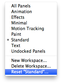 - To create a new composition:
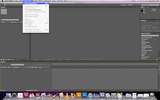
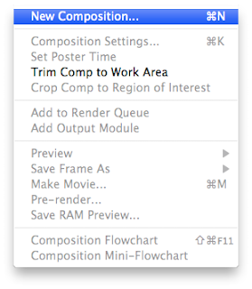 - Setting up the Composition:
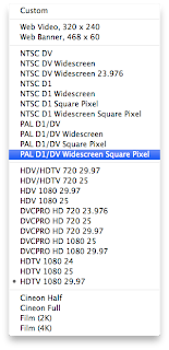
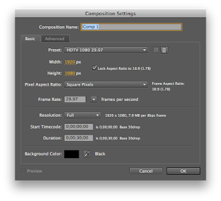 Choose the Preset: (PAL is the UK video standard - 25 frames per second)
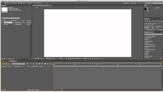
- The updated interface:
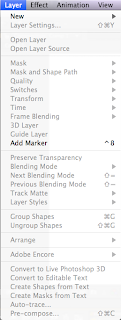
- Add a new layer instead of Importing prepared assets:
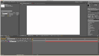
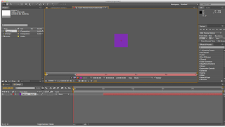
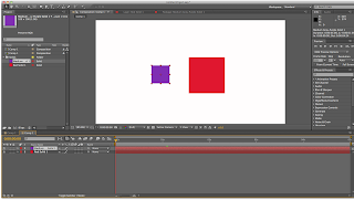
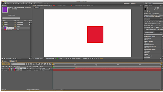
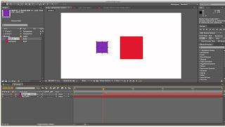
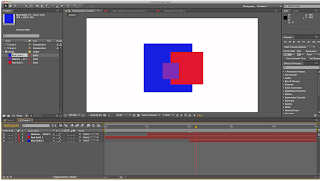

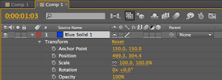
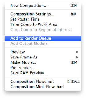
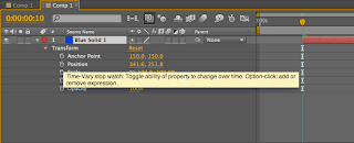


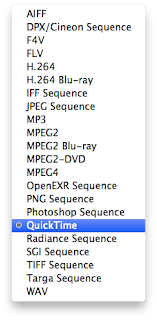
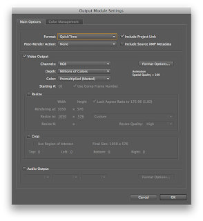
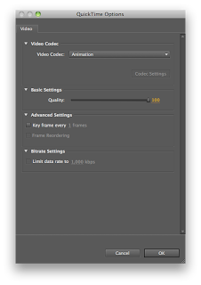
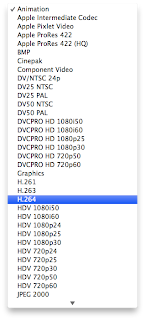
And this is what I created in my first session:
First After Effects Session from Gemma Byrne on Vimeo.
Friday, 12 November 2010
Understanding Keyframes...

At first I found this hard to grasp, but after finding this diagram, it really gives a clear visual as to how this works.
Wednesday, 10 November 2010
Team Impression
Leeds,
LS11 5UU
www.team-impression.com
I took a variety of images with my Digital SLR at Team Impression, however my memory card corrupted and I have lost them all.
It was really interesting to see the printing presses in full working motion, and seeing examples of the packaging coming out. Especially the Jamie Oliver cutlery packaging, seeing the finished printed version which had been die cut and then seeing a finished, assembled version.
Seeing the women in the handcrafting section was odd for me, as I just expected that there would be some machine that can fold, glue and bind things together, with the fast ever advancing technology in printing, there may be a machine soon.
Our tour guide explained how one of the rooms used to have around 10 people in it, but then pointed to a machine in the corner and said it does the same job as what they used to do.
I found it a very interesting experience, I just wish I had the photos to show that!
Tuesday, 9 November 2010
Print Analysis
Twenty Pound Note:
Some of the images used on other bank notes are engraved by hand on metal plates 'whilst others are created using a Computer Aided Design (CAD) system and are drawn onto film by a laserbeam. When finished, the images are duplicated many times onto printed plates ready for the presses. Specialised inks used to produce the notes are also manufactured on site; approximately 85 are required for the four denominations' .
There are three processes used for bank note printing: Offset Litho, Intaglio, Letterpress.
From examining the note, I believe the letterpress is for the type, as some of the lettering is raised.
Intaglio: this process is used to add the portrait of Her Majesty the Queen and the raised print on the front of the note. The ink rests in grooves engraved in the printing plate. When the plate comes into contact with the paper the ink is forcibly ‘drawn’ from the plate onto the paper under very high pressure. This produces the raised print which is one of the characteristics that gives Bank of England notes their distinctive feel.this process is used to add the portrait of Her Majesty the Queen and the raised print on the front of the note. The ink rests in grooves engraved in the printing plate. When the plate comes into contact with the paper the ink is forcibly ‘drawn’ from the plate onto the paper under very high pressure. This produces the raised print which is one of the characteristics that gives Bank of England notes their distinctive feel.
http://www.bankofengland.co.uk/banknotes/about/production.htm
- Stock:The stock is a special paper that combines linen and cotton with a gsm of about 80 to 90, the combination of linen and cotton is for durability.
' Using copious amounts of water, the cotton is broken down into individual fibres and reformed into reels of paper of the quality required.The watermark design is engraved in wax and, like the metallic thread, the image is incorporated into the paper at the manufacturing stage.
- Format:
British bank notes are all of a standard format. The smallest note is a £5, then the next size up is the £10 note then the £20 and £50.
- Specials:
Raised print, Texture of Paper, Holographic strip, Fluorescent features, Microlettering - all of these features are to make it as difficult as possible to create counterfeit notes.
- Target:
The audience is anyone residing or staying in the UK, maybe even people who collect money.
- Quantity:
Very high production rate, by the millions.
- Competition:
Other currencies?
Tuesday, 2 November 2010
Design Practice... Edge
 This is an example of one of the leaflets designed by edge for North Lincolnshire's Primary Care Trust intentions:
- Advertising Campaigns
- Annual Reports, Business Plans
- Company Magazines
- Corporate Gifts
- Corporate Identity
- Copywriting
- Direct Mail
- Exhibitions & Events
- Illustration
- Interior and Exterior Signage
- Leaflets, Brochures, Folders
- List Sourcing
- Newsletters, Newspapers
- Mobile SMS and Bluetooth Marketing
- Packaging Design
- Posters, Point-of-Sale
- Photography
- Press & Public Relations
- Prospectuses
- Sales Promotion Material
- Website and CD Rom Production
Edge has always listened carefully to our brief, ensuring that the opinions of service users have a strong focus on the work they have produced. This work was recently commended by HM Government in the Cabinet Office newsletter –Customer Matters. Crucially, Edge has always delivered work to our exact brief, within agreed deadlines and to budget. I believe that wherever possible we should strive to engage and work with local businesses to help drive improvements within our local economy - the work we have embarked on with edge is the envy of many other programmes and has been replicated in many other screening programmes across England."
Paul Watson
Programme Manager COAST/SHOUT
"Edge and its predecessor companies have produced my Annual Public Health Report for the past 10 years to a high standard. We have also used them to develop publicity and social marketing materials for a number of public health programmes. For all of these they have been creative, helpful and collaborative. Their work has always been delivered on time and to budget. Our long use of the company illustrates this."
Dr Tony Hill
Joint Executive Director of Public Health
Monday, 1 November 2010
A Look At Print...


This is a postcard from a Vernon Street Exhibition, I think it would have been digitally printed due to the low numbers in which these would be printed. The image side has a glossy/silk finish and the back is matte like a traditional postcard. The image is taken from a video by the artist in which a tortoise is on its back


