Wednesday, 15 December 2010
Tuesday, 14 December 2010
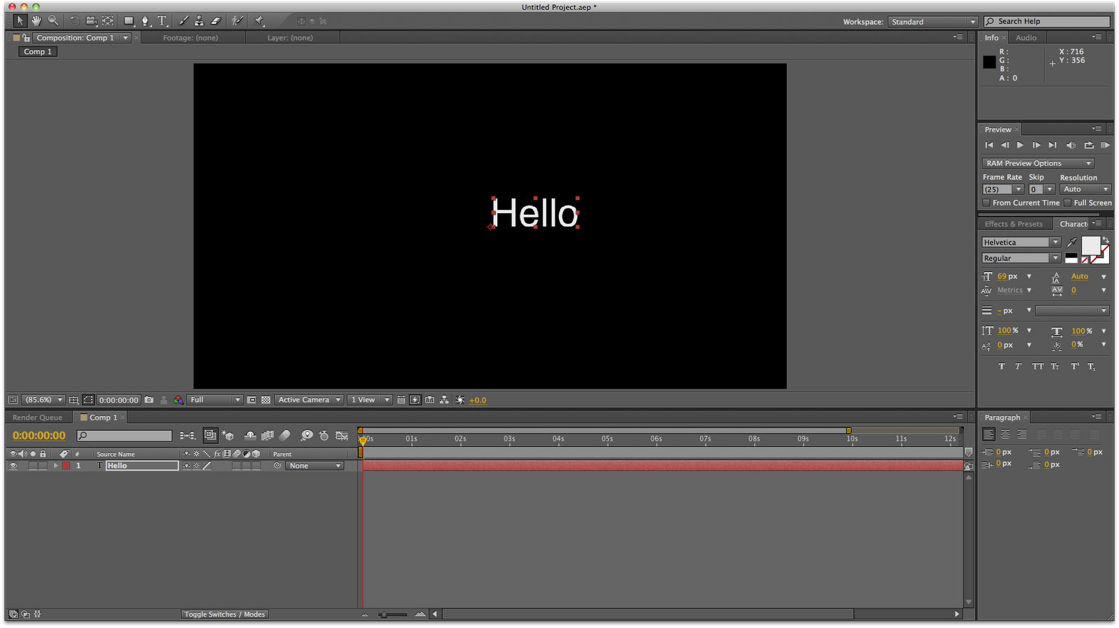
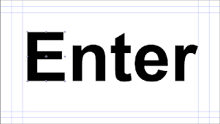
Adobe After Effects... Part 3
Alternate method to inputting text
Layer > New > Text

 - The font can be edited in the character pallet.

- The anchor point is not central, but can be adjusted by pressing A and adjusting the X and Y value.


- The text layer gives a few more options...

- By editing the source text, other words and characters can be added or taken away.

Adding an Animator

Here is what I created...
Layer > New > Text

 - The font can be edited in the character pallet.
- The anchor point is not central, but can be adjusted by pressing A and adjusting the X and Y value.


- The text layer gives a few more options...

- By editing the source text, other words and characters can be added or taken away.

Adding an Animator

Here is what I created...
Last Session... from Gemma Byrne on Vimeo.
Hello hello hello from Gemma Byrne on Vimeo.
Adobe After Effects... Part 3
Alternate method to inputting text
Layer > New > Text
- The font can be edited in the character pallet.- The anchor point is not central, but can be adjusted by pressing A and adjusting the X and Y value.
- The text layer gives a few more options...
- By editing the source text, other words and characters can be added or taken away.
Adding an Animator
Monday, 13 December 2010
Kinetic Typography... Ocean's Eleven
Another cool kinetic type example, with some clever representations throughout, only the keywords appear on the screen...
- 0:16 'through these doors' With the three words going through the stem of a letter, as if going through a set of doors.
- 0:19 'each of which...six digit code' These three words appear in 2 blocks of three, with the order changing, representing the 6 digit code that changes every 12 hours, with the correct code being represented by the each individual word turning green.
- 0:24 'ELEVATOR' This is written on its side and moves vertically from bottom to top, like a lift.
- 0:44 'ELEVATOR' This is a reduced size version which fits on the screen and reads horizontally, with equally spaced black dots across the top and bottom with green lines connecting, showing the laser motion detectors that George Clooney is describing to his group.
Kinetic Typography... Lock, Stock
This is a cool animation based on a scene from Lock, Stock and Two Smoking Barrels. particularly like, the variety of sizes and the different directions in which the text is placed. These kinds of clips only tend to focus on the speech, however, this does emphasise a background noise, two footsteps, which is represented on the screen by two faint foot prints. The colour scheme works well, yellow, black and white which varies in the amounts used throughout. At 0:35 where the voice can be heard saying, 'If you bend the truth...', the text bends into the background, making it look 3D which is really effective. The exclamation mark is used as some kind of knife weapon throughout using a stabbing effect, which again is simple but effective.
Pixar Interview...
 | |
 | September 2005 What’s a typical day like for you? How are shots assigned to you? And what do you start with? How do you begin animating? How do you animate characters in the computer? How long does it take to animate a shot? It sounds fast-paced. What do you do to put yourself in the mindset of your characters? What’s the most challenging aspect of your job? What sequences are you most proud of? There seem to be very few female animators in the industry-do you find that to be the case? Speaking of which, what’s your background? When did you know you wanted to be an animator? So what changed your mind? |
Motion Graphic... Dreamworks
This is a great piece of motion graphics that is universally recognisable, and is usually featured at the beginning of certain films. I can recognise this ident just by the music even if I cannot see the visual, which symbolises a successful piece of design. The way the text is only partially revealed, in a dream-like great.
Wednesday, 8 December 2010
Kinetic Typography...Typolution
Genius. I love this, I love the typography tree, the typography snail, the typography rain and puddles... You get the picture. No fancy flashes or shapes and swirls, just type. The spatial movements really immerse you into this 'type world'. Bloody brilliant!
Kinetic Typography...Roxie!
This is slightly cheesy in areas, but I think the filters/animations of the text really suits the theatrical, musical theme. The colours work well, black and white is always effective, but the scarlet of the heart makes it more effective, as it gives it that feminine, lipstick, show girl feel. At 0:23, the simple use of semi circles changing black, grey and white makes it look like flashing lights you may get in the theatre, this is a simple idea with no lighting, but the way the colours change, give this impression.
Kinetic Typography...Melpomene
The beginning of this is really cool, it looks like the 'structure' is something you would see under the microscope, like a cell. I love use of space and when this 'thing' rotates, the centre is in focus, so the spheres at the end of the spindles are blurred as they move past the camera. The music at the beginning seems to suit this bit also. After 0:27 the clip seems to lose the plot.
Tuesday, 7 December 2010
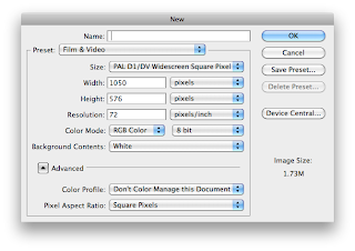
Adobe After Effects... Part 2
Using Photoshop files with After Effects
- Create New File.
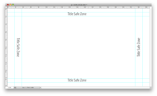
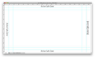
 - The document should look like this, with the automatic guides.
 - Save document as .psd or .tiff.


Importing as Composition - retain layer sizes

- Now the anchor point is different for each character, letters can be edited individually.
And this is what I created...
- Create New File.
 - The document should look like this, with the automatic guides.
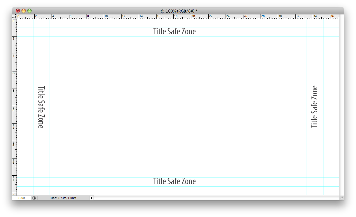
 - Save document as .psd or .tiff.
- .psd is more reliable when wanting to save layers.
Using Illustrator
- New File.
- Note: PAL D1/DV Widescreen - no square pixel as Illustrator doesn't use pixels.


Importing in After Effects - as footage


Setting up the file in After Effects


Importing in After Effects - as a composition


Importing as Composition - retain layer sizes


- Now the anchor point is different for each character, letters can be edited individually.
And this is what I created...
Second Session... from Gemma Byrne on Vimeo.
Second Session Part 2 from Gemma Byrne on Vimeo.
Monday, 6 December 2010
Motion Graphic...MTV Bloom
MTV BLOOM from FMK_7 on Vimeo.
This is more of a motion graphic featuring typography, this is a much more complicated way of communicating type, and it's really effective. I would love to be able to create something like this, where with the other more simplified clips I can work out how the motion is constructed, I have no idea how this one is made.
Motion Graphic... Parkour
parkour motion reel from saggyarmpit on Vimeo.
Absolutely awesome. I always appreciate cool drawings like that, mainly because I can't draw, they are pretty simple, no colour and clear, but really effective. I especially love at 0:09 where the drawing of the building is introduced. I also love the interaction of the drawing with the different folds, it is an incredibly clever concept, and it works.
Motion Graphic... Bin Liner
TRI▲NGLE from Onur Senturk on Vimeo.
This is brilliant! Not sure what it is supposed to represent, but nevertheless it is still impressive, and the audio fits really well.
Kinetic Typography... Psychiatric Answering Machine
I think this is a fantastic piece of kinetic typography, in terms of the visual and the concept which is quite humourous. There are a few
The type used is the same as the narration being played, and the main words throughout are highlighted in red. The visual style of the clip is like a mind map with the different phone options branching off. The animation of each phone option represents the action being described, for example at 0:08 'If you are an obsessive compulsive press 1 repeatedly', the animation for this is multiple different sized, black and white 1s moving between background and foreground - as if the number one button is being pressed continuously.
I also like at 0:15 'Multiple Personality Disorder', which is represented by the word personality in 4 different fonts.
Kinetic Typography... Mad World
I am not posting this because it is something I love (although I do love the song), it isn't one of the greatest clips I have watched, but this is a whole new world to me and I am investigating into different techniques used which can begin to inform my own work.
At 0:06 where the cut out letters appear spelling the title of the track used and the artist, I quite like this, and never thought of incorporating 'real' elements instead of only digital type... if that makes sense?
Again, something I am noticing a lot is the animation reinforcing different words, such as at 0:23, the word bright, being in yellow, when on the whole the text is grey.
Friday, 3 December 2010
Animation News... Rastamouse
DHX Media's 'Rastamouse' Scores Global Sales
December 3, 2010 by Ramin Zahed

How can you not love a stop-motion preschool show about a kind, raggae-singing Rastafarian mouse whose motto is “Making a bad ting good!” Kids worldwide are bound to fall for the new series Rastamouse, which is being distributed by DHX Media outside the U.K. Today, the company announced that it has sold the show to Australia’s ABC TV, Poland’s Canal+ (MiniMini) and Israel’s HOP!
Commissioned by the CBeebies, the 52X11 series is produced by Three Stones Media with Dinamo Productions and Little Roots. The show will premiere in the U.K. on CBeebies in the first quarter of 2011.
The show is based on the books by Michael De Souza and Genevieve Webster. It follows the adventures of Rastamouse, Scratchy and Zoomer—a crime-fighting, mystery-solving, special agent, reggae band. (They believe in redemption not retribution and they go about helping bad guys rebuild their lives!)
Greg Boardman, exec producer at The Rastamouse Company notes, “The sales Rastamousehas achieved to these international territories are fantastic. It’s clear there is a space in the kids market for a show like Rastamouse—which has heart, humor and fun at its very core. We look forward to building the brand with our partner DHX as the program is picked up worldwide.”
To learn more about this clever show, visit www.rastamouse.com.
(Taken from http://www.animationmagazine.net/tv/dhx-media%E2%80%99s-rastamouse-scores-global-sales/)
To watch an episode: http://www.bbc.co.uk/cbeebies/jackanory/stories/rastamousebling/
Thursday, 2 December 2010
Kinetic Typography...One Flew Over The Cuckoo's Nest
This is short but sweet, I believe it is someone's college project.
Kinetic Typography...Stewie Griffin
Sticking with the Family Guy theme, I quite like this example of kinetic type, for many reasons, I like the faded 'ha's' used to show the audience laughing at 0:03. Also at 0:12 where Stewie is saying the material is 'so fresh', the use of blue, yellow and white is visually quite a fresh look. The visualisation also enhances the stutter throughout Stewie's speech notable at 0:14 (I've), 0:19 (reference), 0:23 (that's) and in a few other places. On the second reference of fresh, an animated fancy illustration appears in the left corner to further emphasise this. At 0:45 when Stewie talks about Titanic jokes, I love how the screen is half blue text on white background (top) and white text on blue background (bottom-sea), and the word Titanic snaps in half and sinks, like the ship did.
Kinetic Typography...Peter Griffin
This isn't an example of what I would call good kinetic typography, and I don't think this works without seeing the Family Guy episode, but it was created using After Effects. The multi coloured text seems to work with this one, maybe as it is from a brightly coloured cartoon?
Kinetic Typography... What Does Marsellus Wallace Look Like?
This is a great representation of the scene from Pulp Fiction where Jules Winnfield (played by Samuel L. Jackson) is interrogating Brett. Brett's dialogue appears in a lowercase bluey-white colour, which represents his quiet yet terrified answers, which is shown through the text jumping around in some parts. Jules's dialogue appears in a pale yellow colour, in varying sizes to emphasise different parts of the speech. At 0:05 the text appears to jump up and down which enhaces the noise of the table being turned over and thrown across the room. At 0:38 after the gun shot, there are 'blood stains' in the same colour as Brett's speech to show it's him tht has been shot, and this runs throughout the rest of the speech.
Kinetic Typography...V for Vendetta
The text featured in this is from a scene in V for Vendetta (which I haven't seen), it is a dialogue between two characters in the film. Again, the colours have been kept to a bare minimum to keep simplicity, but there is the use of opacity at 0:14 as the text appears, the previous line fades. At 0:31 the text is no longer appearing as a line, but as individual words which emphasises the staccato in which the speech is delivered. 1:16 is the part which sticks out the most to me, as the visual representation of the man's laughter is completely different from the rest of the clip, and the fast spinning and movement of the 'ha's' could also represent the character's insanity.
Kinetic Typography...Pieces
This is my first piece of independent research into kinetic typography, and even though this clip isn't as impressive as some I have been looking at, it is all still very impressive as at the minute, I am only able to make coloured squares move across the page! This is quite simple in the fact that it sticks to the same font throughout, with the same two colours. The main two features that the clip seems to focus on is the spatial movement of the text moving from background to foreground and vice versa, and rotation, which at times can be disorientating!!
Wednesday, 1 December 2010
Flipbook...
Today should have been my session on flipbooks, but due to a snow day it was cancelled. Therefore I decided to take the time to have a look at flipbooks and how they work...


I created my own flipbook on a website:
Tuesday, 30 November 2010
Morphology...
'A morphology is the study of the structure and form of a language system, including inflection, derivation, and the formation of compounds. In this book, a morphology is presented for the study of the language of motion-graphics design...
The functioning components of the morphology are its various attributes and variables. Generally, the variables cover a spectrum of possibilities for each attribute. Some describe a range, others are distinct opposites. Hierbert describes this as a contrast continuum. Barthes used the term "binary opposition". It is a way of thinking not only about design, but about life. For example, considering the human attribute of "feeling", we do not really understand the variable "happy" until we understand "sad".'

Research taken from Motion Design - Moving Graphics for Television, Music Video, Cinema and Digital Interfaces by Matt Woolman.
Designing For Motion...
'All pictorial form begins with the point that sets itself in motion... The point moves and the line comes into being - the first dimension. If the line shifts to form a plane, we obtain a two-dimensional element. In the movement from plane to spaces, the clash of planes gives rise to body (three dimensional)... A summary of the kinetic energies which move the point into a line, the line into a plane, and the plane into a spatial dimension.'
(Paul Klee)
Adobe After Effects Workshop...
The General Interface:

 - To create a new composition:
 - Setting up the Composition:
 Choose the Preset: (PAL is the UK video standard - 25 frames per second)
- The updated interface:

- Add a new layer instead of Importing prepared assets:

- Select Solid to make a shape:
 - 100 pixels by 100 pixels
 - Layer appears in left hand panel:
- Moving the layer timeline, means this layer will appear later on in the composition rather than at the beginning.


And this is what I created in my first session:
First After Effects Session from Gemma Byrne on Vimeo.
Subscribe to:
Posts (Atom)