Friday, 28 January 2011
Motion Graphic... Pearl & Dean
The 1990's Pearl and Dean advert, this has to be one of the most recognisable adverts in cinema history, even the music alone is recognisable. I would love to create an ident as catchy and captivating as this!
Tuesday, 25 January 2011
Top Ten... Potential Fonts for the Title
I decided I wanted the font for the title of my programme to be a handwritten font, a font that flowed and was most importantly, feminine.
Throw My Hands In The Air:
This is a really clear typeface, it's feminine and definitely a handwritten style, however I would like a font that was perhaps joined up.
 Sunshine in my Soul:
This is a great handwritten font, however I don't think this is entirely appropriate for how I visualise my sequence.

Jellyka Estrya:
At first I thought this would be suitable, but then I decided some of the letterforms are a little too sharp, and it doesn't have the flow I am looking for.

Never Let Go:
This does fit all my criteria, however, I am not so keen on all the letterforms being joined up as it changes the legibility, especially in a handwritten font. I am looking for something elegant, and I am not sure this fits that.

Dawning of a New Day:
This fits with the kind of font I set put to use, it's not too joined up, it's clear.

Honey Script Light:
I think this would be a really suitable font to use, I can imagine this working really well, after seeing how the Bewitched word animates in the title sequence I think this could work really well.

Bickley Script Regular:
This font is absolutely perfect, it is very similar to something I had attempted to draw while chicken scratching. It is a font used by Benefit, which is a company Alice had referred me to during my crit. My only issue is that it isn't a free font so unless I create something very similar with the pen tool, I will have to stick with the Honey Script font.

Sunday, 23 January 2011
Top Ten... Ideal Font Research
Benefit Cosmetics:
I love the font and colours in this example, it's really feminine and elegant, this is something similar to the font I would like to use in my title sequence.

Bewitched Title Sequence:
The stroke effect used on this is brilliant in the title sequence as shown in an earlier blog, but it works just as well static.

My Super Sweet Sixteen:
The stroke text with the shine, is visually how I would like my text to look like.

Paris Hilton Perfume:
This is another example of the style of font I am going for, sophisticated, elegant and feminine.

Thursday, 20 January 2011


Tuesday, 18 January 2011
Adobe After Effects... Part 5
Using sound with animation...
Options:
- Voice over.
- Sound effects.
- Music.
Available:
- From Royalty free audio websites.
- Record it yourself.
Appropriate file formats:
- .AIFF (Mac standard)
- .WAV
- .mp3
- .m4a - After Effects won't work with this.
* Convert in iTunes or Switch.
Adding sound:
File > Import (as footage)

- It will show up in the composition as shown above.
- The only way to hear the audio play back is RAM preview.
Monday, 17 January 2011
Top Ten... Female Icons Research
Now I have decided the subject matter for my title sequence and ident, I need to become an expert in my 'field'. I will look into a number of female icons, I don't necessarily need a top ten as it is only the beginning and promo clips that I am producing. However, it will help for me to narrow down to a select few...
Females considered as icons:
- Marilyn Monroe.
- Audrey Hepburn.
- Princess Diana.
- Cheryl Cole.
- Bettie Page.
- Jayne Mansfield.
- Elizabeth Taylor.
- Angelina Jolie.
- Beyonce Knowles.
- Paris Hilton.
- Victoria Beckham.
- Colleen Rooney.

What icons are famous for? (Based on the previous list)
- Beauty.
- Charisma.
- Social skills.
- Passion for what they do.
- How successful they are.
- What they do to help/empower fans/followers.
Sunday, 16 January 2011
Motion Graphic... Stash DVD
I hired a DVD out from the library which features motion graphics for commercials, music videos, virals, short films and more... Below I have posted some of my favourite features from the DVD.
by John Nolan


This advert is fantastic! The first time I watched it I was extremely nervous for the mouse, until he winks (0:21) and it is clear that the advert will not have an ill fated end. The concept is great, and unlike any other cheese advert out there. The real mouse that is featured in the advert took months to source, and is called 'Sniffles'. The other mouse was sculpted using silicone and fibreglass, and was double the size of Sniffles which featured radio controlled components. Each hair of the mouse was placed in the silicone skin individually by a Creature FX Painter. The set was built in the home of John Nolan, in his kitchen.
Software: After Effects and Final Cut Pro.
- Black Eyed Peas - Boom Boom Pow
Directors: Matthew Cullen and Mark Kudsi


This video features some really cool motion graphics, the band was recreated digitally using scans of their faces. 'The biggest technical challenge was bridging the gap between the custom programs developed in-house with Motion Theory's existing Maya and rendering pipeline to combine all the digital assets including the mo-cap data'.
Software: Maya, mental ray, Nuke, After Effects, Processing, Photoshop, ZBrush, Facial Capture, Motion Builder, C++, Open GL and Flame.
(From this long list of programs it was clearly a complicated and technical process.)
- The Rethink Scholarship
Directors: Rory O'Sullivan and Taran Chadha


This is a really clever idea and uses a hands on approach to creating design for screen, the idea had to work correctly quickly in order to avoid wear and tear on the different pages.
Software: Final Cut
Aides "Graffiti"
Director: Yoann Lemoine


This is a totally different take on campaigns for AIDES, this viral has had over 3 million hits on Youtube and was even featured on E4's programme Rude Tube. It has been created in a humourous way for an otherwise serious issue. I especially like the way the film incorporates, a real scene (the toilets) with animation (the graffiti).
Software: After Effects
Tuesday, 11 January 2011
Adobe After Effects... Part 4
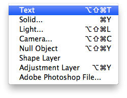
Applying presets to a text layer
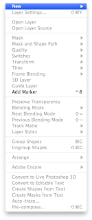
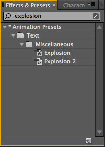
 - On the right hand side of the interface this search box can be found.

- Using layer switches - smaller ones.

1 - Shy switch - layer is still in composition but not in the layer palette.


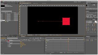
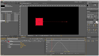
Using acceleration and deceleration
This shows constant speed
This shows a varying speed
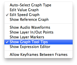
Make sure the graph options are set to editing speed and not values.

 - On the right hand side of the interface this search box can be found.

- Once the preset has been applied, the properties can be expanded and edited to personalise. Pressing U is the shortcut to reveal all animated properties.


1 - Shy switch - layer is still in composition but not in the layer palette.
2- Comp layer - continuously rasterize - for Illustrator files.
3- Quality - to adjust the quality of one or more layers.
4- Effects - turn off.
5- Frame blending - for video.
6- Motion blur - adding a blur to moving shape layer.
Creating a pendulum motion
- Create a solid layer.


- Add a circular mask.

- Change the anchor point using the pan behind tool.
- Adjust the rotation over a series of key frames.

- To make the animation faster, select keyframes, hold Alt and drag together.
Using acceleration and deceleration
- Using the Keyframe Assistant and using Easy Ease In can decelerate an objects speed, and using Easy Ease out can accelerate an objects speed.
- Alternatively, using the speed graph can help you control the same function.
This shows constant speed

This shows a varying speed

Make sure the graph options are set to editing speed and not values.

Accelerate/Decelerate from Gemma Byrne on Vimeo.
Subscribe to:
Posts (Atom)