Monday 31 October 2011

Insert Paranoid Message Here


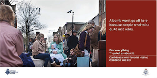
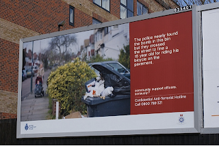
 This isn't an official poster, but has been designed in response to the Met Police poster on my 23rd October blog post. There was a 'remix challenge' on boingboing.net where people were posting their adaptations of the original like the above one, which I absolutely love! It's true, the original, creates a sense of panic.


This is quite a humourous approach to the poster, a total different way of looking at it compared to the one above which is more serious but satirical.

I found a blog (boingboing) with a series of links showing these different 'remixes' I then stumbled upon a Flickr group of 147 different variations!


From the Flickr group:


Using one of the original images from the campaign - but the text is the individuals's own, quite rightly so.


In terms of concept this is fantastic!!


Not aimed at terrorism/cctv but nonetheless humourous and clever.


My version can be seen here. Click the link to my Design Practice.


More Trouble Than Its Worth?

From a news story today (BBC) this could have potentially been really dangerous:


Eyeing Up My Competition

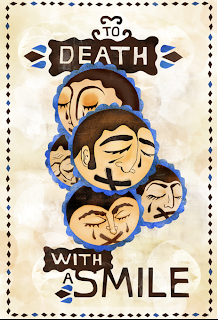
As the deadline for the To Death With A Smile has been, I thought I would have a scout around the internet to see what I am competing with:

I found this on Behance by Ruchi Shah, from India:


This is by Andrew Campos, a graphic designer:


By Marina Linderman on a portfolio site in America:


By Yasmin Marquez:


They are all completely different interpretations to the idea death; some I like, some I'm not so keen on.


Sunday 30 October 2011

Saturday 29 October 2011

Dispatches

This is a trailer for Dispatches: Afghanistan's Dirty War, the type used is appropriate as it has that army feel to it, they way it enters and exits the screen is appropriate for the mood being created, also the colour and font is well suited for the piece. The sound as it appears on the screen makes it seem authentic too. The use of still and moving images throughout is effective.

Friday 28 October 2011

Panorama Trailers

A great example of a series that documents social issues is Panorama. The trailers aren't quite in the style I would like to work in, so I think it will be a one-off documentary.

The above trailer is for the Panorama: Scientology and Me, I watched this as part of my A-Level in Sociology course and it was astounding and slightly sinister. Worth a watch. This trailer is typical of a BBC documentary, but I want to create something darker... After the Breakfast with frost introduction this is a darker, haunting style, the music makes it haunting but the imagery alone is enough to send shivers down anyones spine.

Thursday 27 October 2011

CCTV Documentaries

I know for a fact there have been UK documentaries on CCTV and surveillance, but there appears to be no visual traces of this. There was a documentary on CCTV on Tonight: With Trevor McDonald on ITV, but the only site I could find for it is this. I haven't even been able to find Youtube footage.
There was also a Dispatches episode on CCTV, but again, nothing visual, just the knowledge of its existence from somebody's CV:

Other proof the documentary does exist is this article from: http://findarticles.com/p/articles/mi_qn4156/is_19990321/ai_n13936603/

This highlights the issue of a man who felt he was wrongly accused of a robbery as a result of the CCTV footage showing a man who 'resembled' this same man.

 In a documentary about CCTV for the Channel 4 series Dispatches, to be screened on Thursday, an expert witness compares the CCTV footage of Alan Church recorded during the building society raid with mugshots taken at a similar angle. "I don't believe they are the same person," said Alf Linney, of University College London. Ironically, Church's best chance of clearing his name relies on the CCTV image of the raid being treated as the only enduring record of the crime. The prosecution relied on four eyewitnesses, though the video itself shows clear similarities between Church and the image captured by the surveillance cameras. However Bruce's research shows that such images are open to misinterpretation. "There's a need to be cautious about the use of this evidence in court," she said. "I just feel there should be a warning that if an image of the person looks like someone, it isn't necessarily that person."


Another documentary by Panorama on CCTV by the BBC has also been made, but again it is not accessible.

Tuesday 25 October 2011

How Is Big Brother Watching You?


Another shocking video releasing statements and facts about CCTV and surveillance I had never thought about. (USA video) Not quite as boring visually as the CCTV Britain post.

CCTV Britain

A documentary on CCTV by A2 students. In terms of content, it's really informative, but I wouldn't say it's well designed.

Sunday 23 October 2011

Every Step You Take: Documentary


This is the poster for the documentary 'Every Step You Take' by Nino Leitner, an Austrian documentary maker. It looks more like a horror film to me, with the eerie yellow against the bluey grey. The colours do actually work well, although I am not sure about the alignment of the text, it looks a bit 'here, there and every where!'

I am currently looking at CCTV documentaries to 'promote'. As it stands, my brief is quite lost and has no direction.

Friday 21 October 2011

Giving My Research Context

Part of my crit feedback: Give the research some context, instead of just the visuals surrounding the topic.

CCTV = Closed Circuit Television

A few key passages from Wikipedia:


From the Metropolitan Police site:


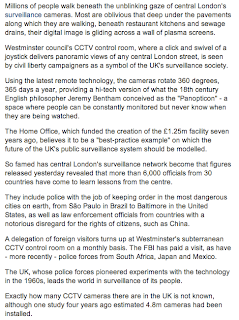
UK underground centre that is spy capital of the world

From the Guardian, Monday 2 March 2009


This next section was the most significant to me:


This place was completely unknown to me until I read this article! I know that the UK are meant to be quite 'high maintenance' on the topic of CCTV but I did not realise that this 'panopitcon' underground facility existed.

Day of The Dead in the Metro


Thursday 20 October 2011

Wednesday 19 October 2011

Southbank Centre


This is a completely different approach to a logo to those I have looked at already. It's very bright, colourful and vivid and the clashing colours really draw your eyes to look. The variety in colour and the different patterns could reflect the variation of events that occur at the Southbank Centre, as it is an arts centre there are exhibitions by known artists, prisoners, music events... It hosts a number of events.

I do think this is much more inviting and friendly looking, the others are maybe too sophisticated. The colourful theme gives a family friendly vibe too.

Guggenheim


Another simple logo, pure text, black and white and minimal. The G's are very similar to the logo used by Gucci with the two G's overlapping but facing opposite directions.


Even by applying the logo to this pack of pencils transforms the product entirely. It's not just any pack of pencils...


The only time the Guggenheim changes it's identity is for the Children's section and it's for education/pronunciation purposes.

Henry Moore Foundation


Compared to some of the other logos I have looked at, this still has the simplicity, but as a serif font has been used it gives it a more traditional feel, which may give a hint as to the types of sculptures exhibited.

Duke of York Square


I think this is a successful logo, it's bold and bright and gives the impression of quality and sophistication, which is what you can expect from this area. I have visited a few times, I first stumbled across it when I visited London alone a couple of years ago!

The Saatchi Gallery


Another simple, almost corporate looking logo. Clear, concise 'does what it says on the tin'. I thought Saatchi and Saatchi may have been behind the branding for this, but there is no information to support this. I was most surprised by this logo, because of it's fantastic, if not expensive location in Chelsea, so I was expecting a scripted, fancier logo than this one. I will be honest, I don't like it.

Love Marks

I haven't really understood what this company are about yet I found them through the Saatchi and Saatchi site, but I did like the diagram to demonstrate what they are about.

'Saatchi & Saatchi looked closely at the question: What makes some brands inspirational, while others struggle?And we came up with the answer: Lovemarks. The future beyond brands.'

I think it is a site where people can nominate their favourite brands or something...


National Portrait Gallery


Similar to the Serpentine Gallery logo, clear and concise, nothing fancy. There is very little information on the history of the branding of this gallery. I can't find any information to suggest who branded the gallery, or any historical information on previous logos/identity.