Showing posts with label OUGD201. Show all posts
Showing posts with label OUGD201. Show all posts
Monday, 13 December 2010
Motion Graphic... Dreamworks
This is a great piece of motion graphics that is universally recognisable, and is usually featured at the beginning of certain films. I can recognise this ident just by the music even if I cannot see the visual, which symbolises a successful piece of design. The way the text is only partially revealed, in a dream-like great.
Wednesday, 10 November 2010
Team Impression
1 Lockwood Close,
Leeds,
LS11 5UU
www.team-impression.com
I took a variety of images with my Digital SLR at Team Impression, however my memory card corrupted and I have lost them all.
It was really interesting to see the printing presses in full working motion, and seeing examples of the packaging coming out. Especially the Jamie Oliver cutlery packaging, seeing the finished printed version which had been die cut and then seeing a finished, assembled version.
Seeing the women in the handcrafting section was odd for me, as I just expected that there would be some machine that can fold, glue and bind things together, with the fast ever advancing technology in printing, there may be a machine soon.
Our tour guide explained how one of the rooms used to have around 10 people in it, but then pointed to a machine in the corner and said it does the same job as what they used to do.
I found it a very interesting experience, I just wish I had the photos to show that!
Tuesday, 9 November 2010
Print Analysis
In groups, we have analysed different types of print, in terms of the process used, special finishes etc. To help us with the analysis we had a linen tester, which is a magnifying glass with a scale, and they are used to look at the quality of fabric...
Twenty Pound Note:
The stock is a special paper that combines linen and cotton with a gsm of about 80 to 90, the combination of linen and cotton is for durability.
' Using copious amounts of water, the cotton is broken down into individual fibres and reformed into reels of paper of the quality required.The watermark design is engraved in wax and, like the metallic thread, the image is incorporated into the paper at the manufacturing stage.
- Format:
British bank notes are all of a standard format. The smallest note is a £5, then the next size up is the £10 note then the £20 and £50.
- Specials:
Raised print, Texture of Paper, Holographic strip, Fluorescent features, Microlettering - all of these features are to make it as difficult as possible to create counterfeit notes.
- Target:
The audience is anyone residing or staying in the UK, maybe even people who collect money.
- Quantity:
Very high production rate, by the millions.
- Competition:
Other currencies?
Twenty Pound Note:
- Process:

There are three processes used for bank note printing: Offset Litho, Intaglio, Letterpress.
From examining the note, I believe the letterpress is for the type, as some of the lettering is raised.
Intaglio: this process is used to add the portrait of Her Majesty the Queen and the raised print on the front of the note. The ink rests in grooves engraved in the printing plate. When the plate comes into contact with the paper the ink is forcibly ‘drawn’ from the plate onto the paper under very high pressure. This produces the raised print which is one of the characteristics that gives Bank of England notes their distinctive feel.this process is used to add the portrait of Her Majesty the Queen and the raised print on the front of the note. The ink rests in grooves engraved in the printing plate. When the plate comes into contact with the paper the ink is forcibly ‘drawn’ from the plate onto the paper under very high pressure. This produces the raised print which is one of the characteristics that gives Bank of England notes their distinctive feel.
http://www.bankofengland.co.uk/banknotes/about/production.htm
- Stock:The stock is a special paper that combines linen and cotton with a gsm of about 80 to 90, the combination of linen and cotton is for durability.
' Using copious amounts of water, the cotton is broken down into individual fibres and reformed into reels of paper of the quality required.The watermark design is engraved in wax and, like the metallic thread, the image is incorporated into the paper at the manufacturing stage.
- Format:
British bank notes are all of a standard format. The smallest note is a £5, then the next size up is the £10 note then the £20 and £50.
- Specials:
Raised print, Texture of Paper, Holographic strip, Fluorescent features, Microlettering - all of these features are to make it as difficult as possible to create counterfeit notes.
- Target:
The audience is anyone residing or staying in the UK, maybe even people who collect money.
- Quantity:
Very high production rate, by the millions.
- Competition:
Other currencies?
Tuesday, 2 November 2010
Design Practice... Edge
newmediachoice was one of the leading design and marketing agencies in the North of England- based in North Kelsey, near Market Rasen in North Lincolnshire. It's a company I have grown up with having taken part in work experience there when I was 16, and I have followed the companies progress ever since. It first began in Sophie Freear's home in Scunthorpe operating from a bungalow, until she moved to North Kelsey, and was lucky enough to purchase a house with a converted barn which she used as her office.
 This is an example of one of the leaflets designed by edge for North Lincolnshire's Primary Care Trust intentions:


Paul Watson
Dr Tony Hill
The client list had extended its services across the Atlantic to San Francisco, and due to the amount of demands on the company, another company was selected to partner and help cope with the demands... this is Edge interactive.
One of the things that first caught my attention with the work by Edge is the exciting fresh feel to every single piece of work, one of their clients is the NHS and visually, their brochures and leaflets are quite dull and don't encourage people to pick them up:
For example, this leaflet isn't a terrible design, the colour scheme works well, but you can almost instantly tell its a serious leaflet...
 This is an example of one of the leaflets designed by edge for North Lincolnshire's Primary Care Trust intentions:
The whole look of this is much more innovative than the previous example, even the use of text wrap makes the layout look a little more exciting. The use of bright images and colours add an air of positivity, which is something the Nhs really needs to promote with their designs, as there are a lot of people who don't have a lot of faith for it.
This is some more work for the Nhs that edge have done:

This is a much more minimal design, but it's really sophisticated and almost quite elegant, with the swirly organic lines and the varying tones used.
Ever since A-level graphics I have always looked at doing health campaigns, as it has always interested me and still does. I spoke to some members of Edge who have said they would definitely look into giving me some work experience, and looking at the work they produce, it would be perfect.
A list of their services...
- Advertising Campaigns
- Annual Reports, Business Plans
- Company Magazines
- Corporate Gifts
- Corporate Identity
- Copywriting
- Direct Mail
- Exhibitions & Events
- Illustration
- Interior and Exterior Signage
- Leaflets, Brochures, Folders
- List Sourcing
- Newsletters, Newspapers
- Mobile SMS and Bluetooth Marketing
- Packaging Design
- Posters, Point-of-Sale
- Photography
- Press & Public Relations
- Prospectuses
- Sales Promotion Material
- Website and CD Rom Production
Testimonials taken from their website:
Edge has always listened carefully to our brief, ensuring that the opinions of service users have a strong focus on the work they have produced. This work was recently commended by HM Government in the Cabinet Office newsletter –Customer Matters. Crucially, Edge has always delivered work to our exact brief, within agreed deadlines and to budget. I believe that wherever possible we should strive to engage and work with local businesses to help drive improvements within our local economy - the work we have embarked on with edge is the envy of many other programmes and has been replicated in many other screening programmes across England."
Paul Watson
Programme Manager COAST/SHOUT
"Edge and its predecessor companies have produced my Annual Public Health Report for the past 10 years to a high standard. We have also used them to develop publicity and social marketing materials for a number of public health programmes. For all of these they have been creative, helpful and collaborative. Their work has always been delivered on time and to budget. Our long use of the company illustrates this."
Dr Tony Hill
Joint Executive Director of Public Health
Thursday, 21 October 2010
Typography with Graham...
First exercise:
Make the following text fit into 2 columns...

How it fits in 2 columns...

Making it fit...

Adding in an image...

Making the image larger and still having readable text...


Make the following text fit into 2 columns...

How it fits in 2 columns...

Making it fit...

Adding in an image...
(Using Text Wrap)

Making the image larger and still having readable text...

Putting all the information in a three column grid...


Wednesday, 20 October 2010
Feedback from Peers...
After representing where I have got up to these were some of the suggestions made by peers that I had got written down:
- Include some kind of web element... I agree with this as at the minute the shops are extremely exclusive, and including a website means the target audience can be opened up much further.
- Look book... This would be a great idea to show off stocks and styles.
- Mock up the shop... This would be incredibly time consuming but a great idea.
- Using a coat hanger as a form of packaging... Hmm not sure, although if I had time to experiment with wire bending etc. it could work well.
- Clear packaging - to promote the contents... Interesting idea, but would need to include some kind of logo.
- For each era have an idol from that time as the 'face' of the shop... Great idea, I think this would be really interesting to work with.
- Transparent bag - with 'face' on which can be held against person's shoulders to morph on to body... Interesting idea, not sure I want to use plastic bags, due to the cheap and nasty connotation it makes me think of.
Tuesday, 19 October 2010
InDesign Workshop...
2Bshot%2B2010-10-19%2Bat%2B14.50.04.png" border="0" alt="" id="BLOGGER_PHOTO_ID_5550935819151915986" />
Reviewing an InDesign File:


 Changing the colour mode to CMYK:
 And it will update the swatch in the pallet:


5) Unused colours on the swatches pallet which may result in blank separations.

6) One image is at 72dpi, which is too much of a low resolution for a 300dpi document.


 The summary of links and images can be viewed too:

Once package and save has been clicked there's the option to add instructions to be sent to the printer:

InDesign files can be exported to PDFs:
Getting files to open with Photoshop:
Reviewing an InDesign File:
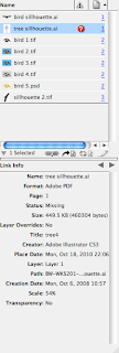
There are 8 problems to be found in the document...
1) Missing link

In the link panel it also shows missing links:

2) Page 1 does not extend to the bleed:

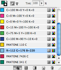
3) One RGB swatch and the document has been produced to be printed.

It can be changed to CMYK by double clicking on the swatch to bring up the options menu:
 Changing the colour mode to CMYK:
 And it will update the swatch in the pallet:
4) 7 printing plates instead of the 5 that there should be.


7) An image has been scaled down in InDesign which is not good practice.

8) Another one of the images has an error, it is in RGB colour mode, meaning it won't print the same as it looks, to change this the original must be edited, which can be done by clicking Edit Original in InDesign. This opens Photoshop, where the colour mode can be adjusted, once Save has been clicked it should update in the InDesign document.

9) The 'back cover' has been applied with the registration key, meaning it will appear on every page.

Printing an InDesign document:
1) Sending the InDesign file with all the links and fonts packaged together:

This shows the preflight dialogue box which highlights any errors and summarises the document:
 The summary of links and images can be viewed too:

InDesign files can be exported to PDFs:
File > Export


Choose the file to export it to, in this case PDF:


Getting files to open with Photoshop:
File > Get Info


Friday, 15 October 2010
Absolute Vintage...

"The best vintage shop in London" by In style Magazine 2008.
Absolute Vintage has one of the largest vintage shoe and bag collections in the UK. It is renowned for having over 1,000 pairs of shoes in stock, all arranged by colour. There is every style and every shade of colour imagineable, they say 'if you can't find it here, it doesn't exist!'. The blend of variety and low prices make it a shoppaholic's heaven... and making it almost an impossibilty to purchase just one pair.
The design of this makes me think of a World War 2 poster. It almost seems slightly American too with the Union Jack being used as the background, as a lot of the American war posters featured their flag, to show their patriotism.
I have noticed with a lot of the Vintage shop logos, a scripted typeface is normally the style of the text used.
Thursday, 14 October 2010
The Cloth House...

The Cloth House is a fabric emporium in London that sells cloths that come from all over the world. It isn't the shop itself that I am particularly interested in, although the shop front is really nice, and looks like an old fashioned shop, what I am drawn to is the logo, which has a 1920's, vintage feel to it. This is the kind of style I would like my logo to be like, in some kind of frame, to make it look almost like an old photo frame or mirror. The fonts used are great, I probably wouldn't use so many different ones in one design, but it does actually look really good.
Steptoes Dog Vintage Wares


This is a Vintage Shop in Leeds called Steptoes Dog Vintage Wares:
Steptoes Dog Antiques,164 Kirkstall Hill, Leeds,LS4 2SX,UK
The shop sells a range of vintage, retro and unique clothing, accessories for women, with a section for men and children too. Their are a variety of other items that can be bought (e.g. pottery, silverware, books, textiles). As well as a shop in Leeds, the items are available online too, there is a sister online site called Ninetynine gifts.
There is a blog which features posts on the latest items and developments in both ninetynine gifts and Step Toes and also a Facebook page where vintage events are posted up, and new items.

The most important part of this is the logos, visually different, but keeping the same font (Cooper Black Std.) and colour, keeps it uniform and recognisable, which is always useful for a brand, in terms of exposure and brand awareness. However, the two logos are significantly different, the first is the case of the type, ninetynine gifts is all lower case which makes it informal and tied in with the style of the font, which although it was produced in the early 20th century by Oswald Bruce Cooper, it does still have a contemporary feel to it. The roundness of the lettering gives it almost a fun feel and I think it suits the gift shop but not as much the shop itself. Although, the uppercase letters at the start of each word makes it a lot more formal, which in my opinion is a more suitable tone for a vintage shop.
The colours for the decoration in each logo are different, in the first example, there is the botanical design overlayed in a lighter grey which runs from the gap in the two words to the left of the words which gives flow to the text, which is split into two by the words Vintage Wares (in a marroon colour, which has a vintage effect) running through, I am not quite sure if this looks right, and it doesn't make me read the text in the order it should be in. The decoration for the gift shop logo is much more colourful and makes me think of party streamers and fun occasions, which suits a gift shop identity.
Wednesday, 13 October 2010
Seventies Music...
Although it may not effect the design aspect of my work, in trying to create the ultimate vintage experience I want to look into different aspects of each era as previously stated, music is an important part of any era...
The Top 100 Seventies Singles CD:
Artists:
The Top 100 Seventies Singles CD:
| The Top 10 Singles of 1970 |
1. | |
2. | |
3. | |
4. | |
5. | |
6. | |
7. | |
8. | |
9. | |
10. |
| The Top 10 Singles of 1971 |
1. | |
2. | |
3. | |
4. | |
5. | |
6. | |
7. | "Just My Imagination (Running Away With Me)" - The Temptations |
8. | |
9. | |
10. |
| The Top 10 Singles of 1972 |
1. | |
2. | |
3. | |
4. | |
5. | |
6. | |
7. | |
8. | |
9. | |
10. |
| The Top 10 Singles of 1973 |
1. | "Tie A Yellow Ribbon Round The Ole Oak Tree" - Dawn featuring Tony Orlando |
2. | |
3. | |
4. | |
5. | |
6. | |
7. | |
8. | |
9. | |
10. |
| The Top 10 Singles of 1974 |
1. | |
2. | |
3. | |
4. | |
5. | |
6. | |
7. | |
8. | |
9. | |
10. | "T.S.O.P. (The Sound Of Philadelphia)"" - MFSB featuring The Three Degrees |
| The Top 10 Singles of 1975 |
1. | |
2. | |
3. | |
4. | |
5. | |
6. | |
7. | |
8. | |
9. | |
10. |
| The Top 10 Singles of 1976 |
1. | |
2. | |
3. | |
4. | |
5. | |
6. | |
7. | |
8. | |
9. | |
10. |
| The Top 10 Singles of 1977 |
1. | |
2. | |
3. | |
4. | |
5. | |
6. | |
7. | |
8. | |
9. | |
10. |
| The Top 10 Singles of 1978 |
1. | |
2. | |
3. | |
4. | |
5. | |
6. | |
7. | |
8. | |
9. | "You're The One That I Want" - John Travolta & Olivia Newton-John |
10. |
| The Top 10 Singles of 1979 |
1. | |
2. | |
3. | |
4. | |
5. | |
6. | |
7. | |
8. | |
9. | |
10. |
Artists:
POP
- Kate Bush
- Brotherhood of Man
- Eric Carmen
- Carpenters
- Cher
- The Kiki Dee Band
- Neil Diamond
- Roberta Flack
- The Four Seasons
- Art Garfunkel
- Englebert Humperdink
- Billy Joel
- Elton John
- Tom Jones
- Lulu
- Barry Manilow
- Paul McCartney
- Olivia Newton-John
- Donny Osmond
- Leo Sayer
- Simon and Garfunkel
- Ringo Starr
- Cat Stevens
- Rod Stewart
- Barbara Streisand
- Tina Turner
DANCE AND R&B
- Abba
- Beegees
- Blondie
- Chairman of the Board
- Natalie Cole
- Commodores
- First Choice
- Four Tops
- Aretha Franklin
- Marvin Gaye
- Gloria Gaynor
- Hot Chocolate
- Michael Jackson
- Jackson 5
- KC and the Sunshine Band
- Chaka Khan
- Johnny Nash
- Billy Ocean
- Diana Ross
- Sister Sledge
- Spinners
- Donna Summer
- Temptations
- Village People
- Stevie Wonder
ROCK AND ROLL:
- Ace
- Aerosmith
- Bad Company
- Bad Finger
- Bay City Rollers
- Pat Benetar
- Blue Oyster Cult
- Boston
- David Bowie
- Eric Clapton
- Alice Cooper
- Creedence Clearwater Revival
- Crosby, Stills and Nash
- Dire Straits
- The Doors
- Doctor Hook
- Bob Dylan
- Eagles
- Firefall
- Fleetwood Mac
- Free
- Genesis
- Guess Who
- George Harrison
- Jethro Tull
- Janis Joplin
- Kansas
- John Lennon
- Lynryd Skynryd
- Meatloaf
- Steve Miller
- Moody Blues
- Van Morrison
- Pink Floyd
- Iggy Pop
- Elvis Presley
- Queen
- Lou Reed
- Rolling Stones
- Roxy Music
- Santana
- Slade
- Status Quo
- T. Rex
- Van Halen
- The Who
- Yes
- Neil Young
- ZZ Top
I think it's quite clear from the list my preferred genre from this era, mainly because it is what my parents listened to.
The music list will go towards what I will propose for the shop, as I am designing the printables, and proposing the rest of the concept for the other decisions.
Subscribe to:
Posts (Atom)